Visualizing Correlations in R: Matrix and Scatter Plot

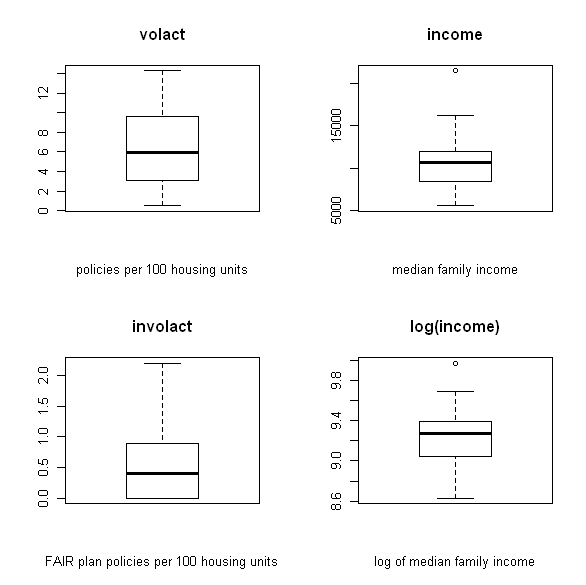
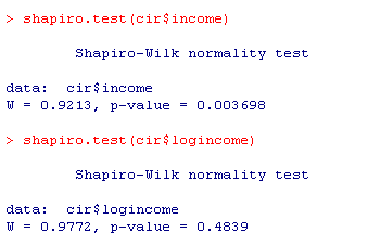
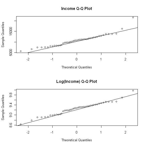
I like to use R when I need to create a correlation matrix and scatter plot for a large number of variables. For example, this is what I want to create for a data set with insurance variables (click images to enlarge):

Figure 1. Correlation matrix of insurance variables
correlation matrix

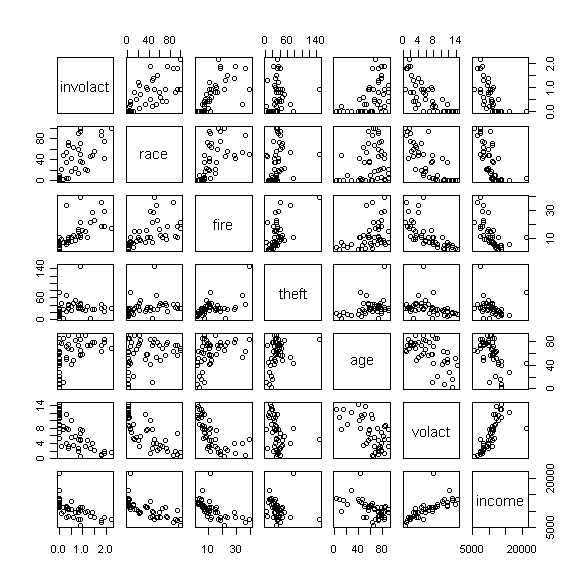
Figure 2. Scatterplot matrix of insurance variables
scatterplot_matrix

Here are the steps I use to create the output shown above:

1. First I need to read in my text file, which contains a header row and 8 columns:

cir<-read.table(“CIR.txt”,header=TRUE)

2. Then I make a couple of changes to the file before I run the correlation matrix and create the scatter plot. I keep columns two through five the same (skipping the first column), but I rename the seventh variable to “involact” and modify income (column eight) so that it is calculated in the thousands:

cir<-data.frame(cir[,2:5],involact=cir[,7],income=cir[,8]/1000)

3. Next I create the correlation matrix and the scatterplot, but I round the numbers to three decimal places to make the output more readable for the correlation matrix. To create the scatterplot, I specify that I want to show the relationships with the target variable involact , and then I list the names of the other variables I want to show:

round(cor(cir),3)
pairs(involact~race+fire+theft+age+volact+income, data=cir)

ORA-00972 Error with SQL Pass-Through in SAS

If you are using explicit pass-through syntax in SAS, you can run into problems when naming conventions in the native database are different from those in SAS. For example, this can happen when SAS allows more characters for an identifier than Oracle does. I ran the following statements in SAS to pull some pharmacy claims and got an error in my log:

proc sql;
connect to oracle (path=”pathname” user=xxxxxxx password=xxxxxxxx);
create table sasuser.thrx_rx_claim_2012 as
  select * from connection to oracle
    (
    select a.indiv_enterprise_id
    ,b.clm_pd_dt
    ,b.svc_beg_dt
    ,b.svc_end_dt
    ,b.elgbl_chrg_amt
    ,b.mail_retl_cd
    ,b.new_prscrptn_ind
      from c31497.thrx_id_elig_rsk_cens_dedup_2012 a
      left join ccdm_mart.clm_svc b on a.indiv_enterprise_id=b.indiv_enterprise_id
        where svc_beg_dt >= to_date(’01/01/2012′,’mm/dd/yyyy’)
        and svc_beg_dt <= to_date(’12/31/2013′,’mm/dd/yyyy’)
        and CVRD_AMT<>NOT_COVRD_AMT
        and clm_frmt_ty=’RX’
    )
;
quit;

Here is the error I received in the log:
ORA-00972: identifier is too long

An identifier can refer to a table name or a column (variable) name. In this case the table name thrx_id_elig_rsk_cens_dedup_2012 in the FROM statement is exactly 32 characters, which is the maximum allowable in SAS. However, Oracle gives you a maximum of 30 characters, so the query will not run.

Case-Sensitive Schema in a SAS Libname Statement

This is a minor annoying issue that had been bothering me for a few years (!) and was finally resolved with a ticket to SAS Tech Support. I have several libname statements that I have been using to connect to DB2 databases. In the past, the libname statements all ran successfully, and I was able to query the tables in the databases. However, when I tried to view the tables under my assigned libraries in the SAS Explorer window by clicking on the libname, the libraries appeared empty. This was irritating since I either had to use another tool if I wanted to browse the tables and look at the actual data, or rely on Proc Contents.

The answer to the problem turns out to be that some schemas are case-sensitive. SAS Tech Support suggested trying the following libname statements:

libname CRDM1 db2 dsn=crdm schema=appdm uid=xxxxx pwd=xxxxxx sql_functions=all dbindex=yes;

libname CRDM2 db2 dsn=crdm schema=”appdm” uid=xxxxx pwd=xxxxxx sql_functions=all dbindex=yes;

libname CRDM3 db2 dsn=crdm schema=APPDM uid=xxxxx pwd=xxxxxx sql_functions=all dbindex=yes;

libname CRDM4 db2 dsn=crdm schema=”APPDM” uid=xxxxx pwd=xxxxxx sql_functions=all dbindex=yes;

The first and second libname statements didn’t display the tables, but the last two with the schema in all CAPS both worked.

Testing for Normality in R

In the post that follows, I will show how to test for normality in R, both by visual examination of box plots and q-q plots, and also by using the Shapiro-Wilk normality test. R code and output are included for all steps. The first step is to read in the data file, which already includes the variable “income.” I then calculate the log transformation of income and add it to the data set:

cir<-read.table(“CIR.txt”,header=TRUE)
cir<-cbind(cir,logincome=log(cir$income))

Next I create four boxplots, naming each and labeling the x axis. I wish to display all four on a single page in a 2 x 2 matrix (click the images below to enlarge):

layout(matrix(1:4,2,2))
boxplot(cir$volact,xlab=”policies per 100 housing units”,main=”volact”)
boxplot(cir$involact,xlab=”FAIR plan policies per 100 housing units”,main=”involact”)
boxplot(cir$income,xlab=”median family income”,main=”income”)
boxplot(cir$logincome,xlab=”log of median family income”,main=”log(income)”)

boxplot_1

At a glance, the volact box plot looks the most symmetrical, from which we can infer normal distribution. Involact and income appear less normally distributed than volact. The log (income) box plot looks a little better than the income box plot, but it is difficult to say for sure. We can verify this by running the Shapiro-Wilk normality test on each variable, where the null hypothesis assumes normality (results shown below for income vs. log (income)).
normality_test_r

For income, the normality test gives small W and p-values which would cause us to reject H0 (normal distribution) at alpha=0.05 and conclude the distribution of income is not normal. Results for the transformation log (income) show normal distribution, which we can conclude from the large p-value and larger W. This makes sense, since we know that income is seldom normally distributed; the distribution is typically skewed by very high outliers.

We can also compare q-q plots of the variables:

layout(matrix(1:2,2,2))
qqnorm(cir$income,main=”Income Q-Q Plot”)
qqline(cir$income)
qqnorm(cir$logincome,main=”Log(Income) Q-Q Plot”)
qqline(cir$logincome)

qqplot

For a normally-distributed variable, the q-q plot should appear roughly linear. For a right-skewed variable such as income, the log transformation addresses the higher outliers, and we can see some improvement from examining the upper right of the q-q plot. However, as we have also seen by looking at the box plots, it is sometimes difficult to tell by visual examination alone, and it is useful to get corroboration by running normality tests such as the one shown above (Shapiro-Wilk).

Model Evaluation: Explaining the Cumulative Lift Chart

I recently developed a model for a client in which the goal was to identify at-risk customers with chronic conditions to target for outreach in a health coaching program. By targeting the customer for outreach, we hoped to improve the patient’s health, medication adherence, and avoid costly emergency room visits and inpatient admissions. In order to explain how effective the model was, I used a cumulative lift chart created in SAS Enterprise Miner (click the image below to enlarge):

lift_chart

The x-axis shows the percentile and the y-axis shows lift. Keep in mind that the default (no model), is a horizontal line intersecting the y-axis at 1. If we contact a random 10% of the population using no model, we should get 10% of the at-risk customers by default; this is what we mean by no lift (or lift=1). The chart above shows that using the given model we should be able to capture 32-34% of the at-risk customers for intervention if we contact the customers with risk scores in the top 10 percentile (shown by the dashed line). That is more than 3 times as many as if we use no model, so that is our “lift” over the baseline. Here is another example using te same chart: we can move to the right on the lift curve and contact the top 20% of our customers, and we would end up with a lift of about 2.5. This means that by using the model, we could capture about 50% of the at-risk customers if we contact just 20% of them.

The cumulative lift chart visually shows the advantage of using a predictive model to choose who to outreach by answering the question of how much more likely we are to reach those at risk than if we contact a random sample of customers.