Tag Archives: model evaluation

Create Cumulative Lift Charts in SAS Without Enterprise Miner

SAS Enterprise Miner creates cumulative lift charts for you as part of the model evaluation process (for more about cumulative lift charts, see my previous post). But what if you don’t have access to SAS EM and want to create a lift chart in Base SAS?

First we can use PROC RANK to order the observations in the scored dataset and assign to a decile. We’ll use the deciles as points on the X axis in the cumulative lift chart:

proc rank data=sasuser.scored_data out=deciles ties=low
descending groups=10;
var score;
ranks decile;
run;

Next we find the true positive rate for each decile by summing the positive values for the target. Our target variable is a binary variable with 1 indicating a positive value and 0 a negative value. Since PROC RANK gave the decile values from 0-9, we add 1 to this value so we will eventually have values of 1-10 on the X axis:

proc sql;
select sum(target) into: total_hits
from sasuser.scored_data
;
create table lift as
select
sum(target)/&total_hits as true_positive_rate
,decile + 1 as decile
from deciles
group by decile
order by decile
;
quit;

Finally, we use a data step to get the cumulative lift:

data cum_lift;
set lift;
cum_positive_rate + true_positive_rate;
cum_lift=cum_positive_rate/(decile/10);
run;

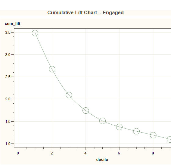
Now the data is ready to plot with PROC GPLOT. We use the symbol statement with i=spline to add a line to the graph connecting all the points (click on the image below to enlarge):

proc gplot data=cum_lift;
title ‘Cumulative Lift Chart’;
symbol i=spline;
plot cum_lift*decile /grid;
run;
quit;

cum_lift

Model Evaluation: Explaining the Cumulative Lift Chart

I recently developed a model for a client in which the goal was to identify at-risk customers with chronic conditions to target for outreach in a health coaching program. By targeting the customer for outreach, we hoped to improve the patient’s health, medication adherence, and avoid costly emergency room visits and inpatient admissions. In order to explain how effective the model was, I used a cumulative lift chart created in SAS Enterprise Miner (click the image below to enlarge):

lift_chart

The x-axis shows the percentile and the y-axis shows lift. Keep in mind that the default (no model), is a horizontal line intersecting the y-axis at 1. If we contact a random 10% of the population using no model, we should get 10% of the at-risk customers by default; this is what we mean by no lift (or lift=1). The chart above shows that using the given model we should be able to capture 32-34% of the at-risk customers for intervention if we contact the customers with risk scores in the top 10 percentile (shown by the dashed line). That is more than 3 times as many as if we use no model, so that is our “lift” over the baseline. Here is another example using te same chart: we can move to the right on the lift curve and contact the top 20% of our customers, and we would end up with a lift of about 2.5. This means that by using the model, we could capture about 50% of the at-risk customers if we contact just 20% of them.

The cumulative lift chart visually shows the advantage of using a predictive model to choose who to outreach by answering the question of how much more likely we are to reach those at risk than if we contact a random sample of customers.