In the post that follows, I will show how to test for normality in R, both by visual examination of box plots and q-q plots, and also by using the Shapiro-Wilk normality test. R code and output are included for all steps. The first step is to read in the data file, which already includes the variable “income.” I then calculate the log transformation of income and add it to the data set:
cir<-read.table(“CIR.txt”,header=TRUE)
cir<-cbind(cir,logincome=log(cir$income))
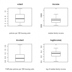
Next I create four boxplots, naming each and labeling the x axis. I wish to display all four on a single page in a 2 x 2 matrix (click the images below to enlarge):
layout(matrix(1:4,2,2))
boxplot(cir$volact,xlab=”policies per 100 housing units”,main=”volact”)
boxplot(cir$involact,xlab=”FAIR plan policies per 100 housing units”,main=”involact”)
boxplot(cir$income,xlab=”median family income”,main=”income”)
boxplot(cir$logincome,xlab=”log of median family income”,main=”log(income)”)
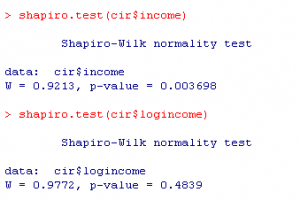
At a glance, the volact box plot looks the most symmetrical, from which we can infer normal distribution. Involact and income appear less normally distributed than volact. The log (income) box plot looks a little better than the income box plot, but it is difficult to say for sure. We can verify this by running the Shapiro-Wilk normality test on each variable, where the null hypothesis assumes normality (results shown below for income vs. log (income)).

For income, the normality test gives small W and p-values which would cause us to reject H0 (normal distribution) at alpha=0.05 and conclude the distribution of income is not normal. Results for the transformation log (income) show normal distribution, which we can conclude from the large p-value and larger W. This makes sense, since we know that income is seldom normally distributed; the distribution is typically skewed by very high outliers.
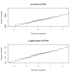
We can also compare q-q plots of the variables:
layout(matrix(1:2,2,2))
qqnorm(cir$income,main=”Income Q-Q Plot”)
qqline(cir$income)
qqnorm(cir$logincome,main=”Log(Income) Q-Q Plot”)
qqline(cir$logincome)
For a normally-distributed variable, the q-q plot should appear roughly linear. For a right-skewed variable such as income, the log transformation addresses the higher outliers, and we can see some improvement from examining the upper right of the q-q plot. However, as we have also seen by looking at the box plots, it is sometimes difficult to tell by visual examination alone, and it is useful to get corroboration by running normality tests such as the one shown above (Shapiro-Wilk).

